Assume that we have 4 items for user to select.
We can use the following example:
display.setStatusBar( display.HiddenStatusBar )
local widget = require( "widget" )
-- Listen for segmented control events
local function onSegmentPress( event )
    local target = event.target
    print( "Segment Label is:", target.segmentLabel )
    print( "Segment Number is:", target.segmentNumber )
end

-- Create a default segmented control
local segmentedControl = widget.newSegmentedControl
{
    left = 36,
    top = 150,
    segmentWidth = 24,
    segments = { "1", "2", "3", "4" },
    defaultSegment = 2,
    onPress = onSegmentPress
}
Check the result:
Not bad...
However, you will find that the width of item can be adjusted by segmentWidth.
How about the height value?
It seems that we cannot modify it.
On the other hand, we may want to have our own style.
How to do?
First, we need to prepare a image file as the source of ImageSheet.
It should include 7 pictures, which are the left/middle/right frames for unselected items, and the left/middle/right frames for selected items. The last one is the divider of segment frame.
The image file:

display.setStatusBar( display.HiddenStatusBar )
local widget = require( "widget" )
-- Listen for segmented control events
local function onSegmentPress( event )
    local target = event.target
    print( "Segment Label is:", target.segmentLabel )
    print( "Segment Number is:", target.segmentNumber )
end

local options = {
     frames =
     {
         { x=0, y=0, width=24, height=20 },
         { x=26, y=0, width=24, height=20 },
         { x=52, y=0, width=24, height=20 },
         { x=78, y=0, width=24, height=20 },
         { x=104, y=0, width=24, height=20 },
         { x=130, y=0, width=24, height=20 },
         { x=156, y=0, width=1, height=20 }
     },
     sheetContentWidth = 157,
     sheetContentHeight = 20
 }
 local segmentSheet = graphics.newImageSheet( "imageSheet.png", options )
 local segmentedControl = widget.newSegmentedControl
 {
     left = 100,
     top = 100,

     sheet = segmentSheet,
     leftSegmentFrame = 1,
     middleSegmentFrame = 2,
     rightSegmentFrame = 3,
     leftSegmentSelectedFrame = 4,
     middleSegmentSelectedFrame = 5,
     rightSegmentSelectedFrame = 6,
     segmentFrameWidth = 24,
     segmentFrameHeight = 20,

     dividerFrame = 7,
     dividerFrameWidth = 1,
     dividerFrameHeight = 20,

     labelSize=12,
  labelColor = { default={ 0.5, 0.5, 0.5 }, over={ 1, 1, 1 } },
     segmentWidth = 24,
     segments = { "1", "2", "3", "4", "5"},
     defaultSegment = seg,
     onPress = onSegmentPress
 }
Check the result: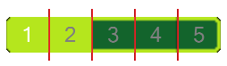
There are two issues.
First, item 1 and item 2 are highlighted at the same time.
Second, the height of divider is not correct. It is system default setting, but not 20 as expected.
For issue 1, we can modify the width for frame 4 (leftSegmentSelectedFrame).
We just minus it by the width of divider:
local options = {
     frames =
     {
         { x=0, y=0, width=24, height=20 },
         { x=26, y=0, width=24, height=20 },
         { x=52, y=0, width=24, height=20 },
         { x=78, y=0, width=23, height=20 },
         { x=104, y=0, width=24, height=20 },
         { x=130, y=0, width=24, height=20 },
         { x=156, y=0, width=1, height=20 }
     },
     sheetContentWidth = 157,
     sheetContentHeight = 20
 }
That is, we need to let its value to be less than segmentWidth.For issue 2, we need to remove segmentedControl and add it again:
local segmentedControl = widget.newSegmentedControl
 {
     left = 100,
     top = 100,

     sheet = segmentSheet,
     leftSegmentFrame = 1,
     middleSegmentFrame = 2,
     rightSegmentFrame = 3,
     leftSegmentSelectedFrame = 4,
     middleSegmentSelectedFrame = 5,
     rightSegmentSelectedFrame = 6,
     segmentFrameWidth = 24,
     segmentFrameHeight = 20,

     dividerFrame = 7,
     dividerFrameWidth = 1,
     dividerFrameHeight = 20,

     labelSize=12,
  labelColor = { default={ 0.5, 0.5, 0.5 }, over={ 1, 1, 1 } },
     segmentWidth = 24,
     segments = { "1", "2", "3", "4", "5"},
     defaultSegment = seg,
     onPress = onSegmentPress
 }
 segmentedControl:removeSelf( )
 local segmentedControl = widget.newSegmentedControl
 {
     left = 100,
     top = 100,

     sheet = segmentSheet,
     leftSegmentFrame = 1,
     middleSegmentFrame = 2,
     rightSegmentFrame = 3,
     leftSegmentSelectedFrame = 4,
     middleSegmentSelectedFrame = 5,
     rightSegmentSelectedFrame = 6,
     segmentFrameWidth = 24,
     segmentFrameHeight = 20,

     dividerFrame = 7,
     dividerFrameWidth = 1,
     dividerFrameHeight = 20,

     labelSize=12,
  labelColor = { default={ 0.5, 0.5, 0.5 }, over={ 1, 1, 1 } },
     segmentWidth = 24,
     segments = { "1", "2", "3", "4", "5"},
     defaultSegment = seg,
     onPress = onSegmentPress
 }
The final result:
沒有留言:
張貼留言